반응형
기존에 display: table로 표현했다가 height가 내용에 따라 달라지며 깨지는 부분이 발생해 이를 수정

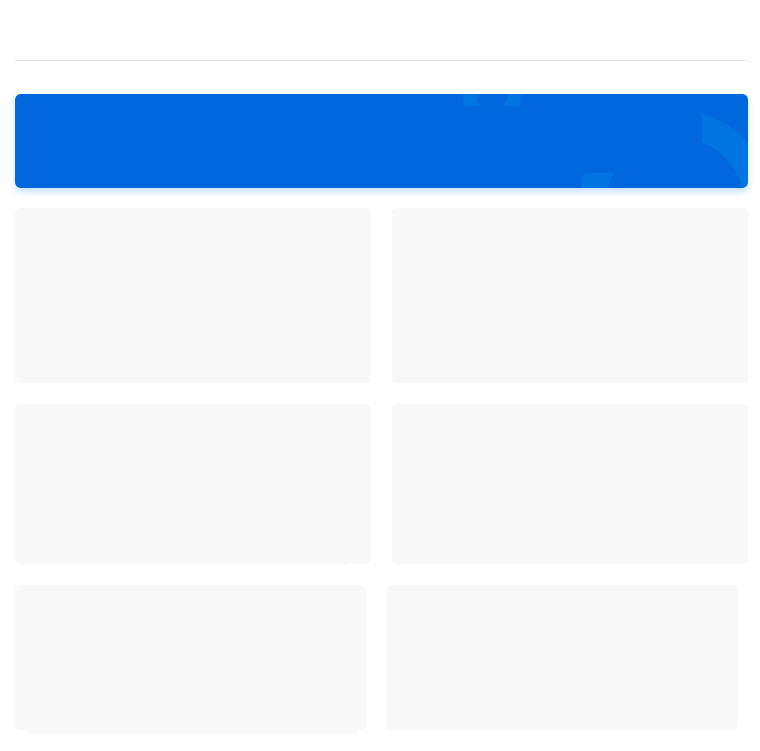
⬆️ before / after ⬆️
Before Code
<style>
	.results-con > li{
		float: left;
		margin: 16px 0 0 16px;
		width: calc(50% - 16px);
		background: #f8f8f8;
		border-radius: 8px;
		display: table;
	}
</style>
After Code
<style>
	/* flexbox 방식 */
	.results-con {
		display: flex;
		flex-wrap: wrap;
		gap: 16px;
	}

	.results-con > li {
    	/* before에서 margin-left에서 16, width에서 16이 줄어들기 때문에 -32 */
		flex: 1 1 calc(50% - 32px);
		margin: 16px 0 0 0;
		background: #f8f8f8;
		border-radius: 8px;
		display: block;
	}
</style>
<!-- li, th,  td등 요소들 불러오고 나서 스크립트 실행 -->
<script>
	document.addEventListener('DOMContentLoaded', function() {
		var listItems = document.querySelectorAll('td');
		var maxHeight = 0;

		// 모든 li 태그의 높이 중에서 가장 큰 값을 찾음
		listItems.forEach(function(td) {
			var thisHeight = td.offsetHeight;
			if (thisHeight > maxHeight) {
				maxHeight = thisHeight;
			}
		});

		//var height = maxHeight - 90;

		// 모든 li 태그에 가장 큰 높이를 적용
		listItems.forEach(function(td) {
			td.style.height = maxHeight + 'px';
		});
	};
</script>
반응형
'Frontend > CSS' 카테고리의 다른 글
| [HTML] 테이블 관련 요소 들 (0) | 2024.08.29 |
|---|---|
| [CSS] 스크롤 달기 (feat.Overflow) (0) | 2024.03.13 |
| 크기 조절 (0) | 2024.02.19 |
| 01/19 회고 (0) | 2024.01.19 |
